Apple TV Watchlist

Tech & Entertainment, Streaming

Closing the $62M Content Discovery Gap

Tech & Entertainment, Streaming

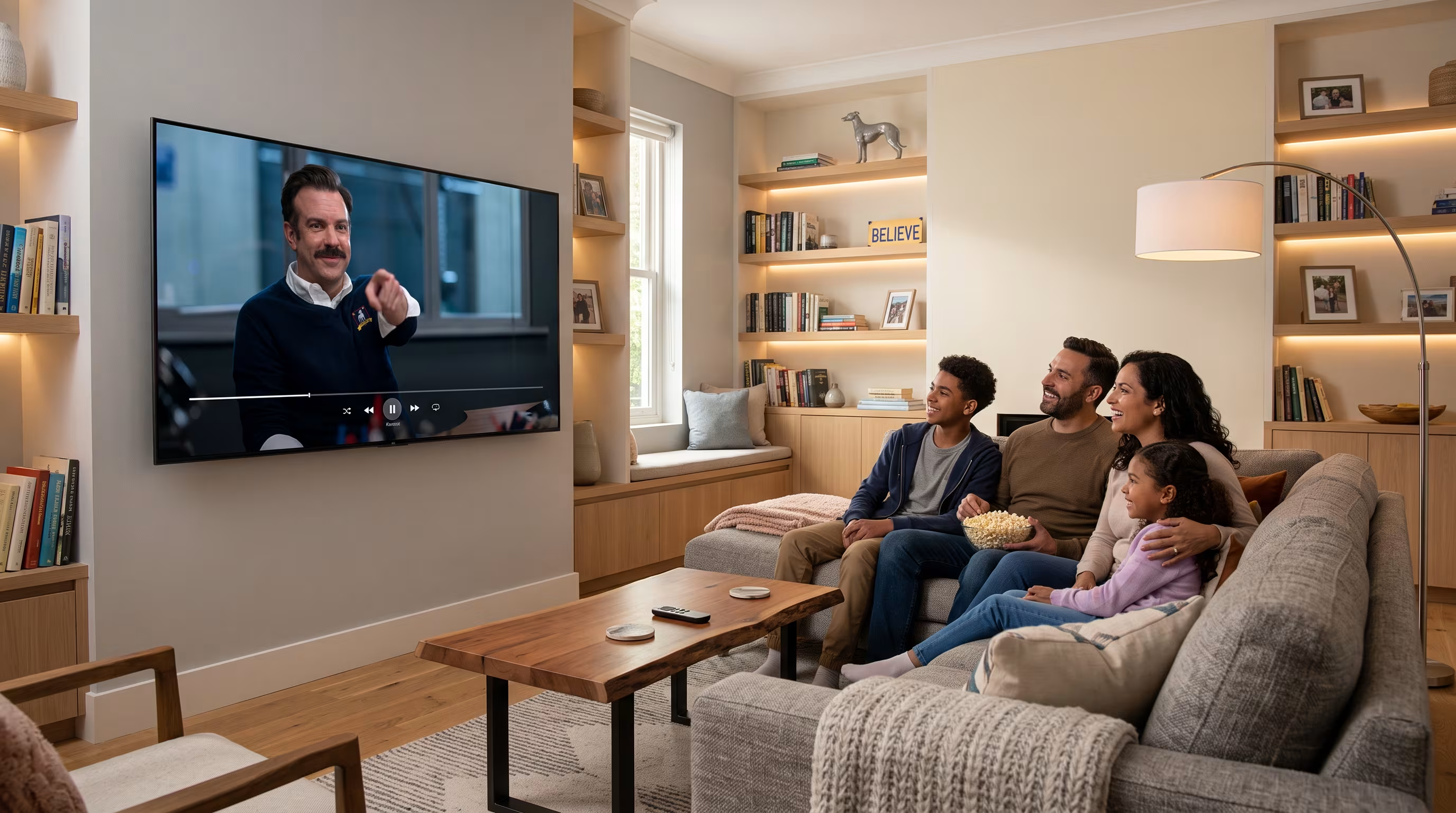
Family of four sitting on a couch watching a TV show, sharing popcorn in a cozy living room.

Apple TV was the only major streaming platform without a dedicated watchlist feature. While competitors like Netflix, Disney+, and HBO offered 'My List' functionality, Apple TV+ subscribers relied on a cluttered 'Up Next' queue that mixed ongoing shows with future viewing plans.

Concept Work

Promote Engagement & Retention

62M+ Subscribers

The Feature That 74% of Streaming Users Demand

01

The Context

74% of streaming users actively use watchlist features (HubSpot, 2022)

~45M+ subscribers lacked basic content organization tools

User dissatisfaction could drive churn and hinder new acquisitions

Why It Matters

A 2023 Nielsen report revealed that 63% of users add watchlist content to plan their viewing, while 50% use them to remember what they want to watch later. The current "Up Next" queue served neither purpose effectively. Real user feedback from Apple Forums captured the frustration: "I can literally go to a show, see that I've added it to my list, yet the list is NO WHERE to be found."

The Business Case

Directly influences content promotion and engagement

Reduces churn by increasing platform "stickiness"

Provides valuable user intent data beyond viewing history
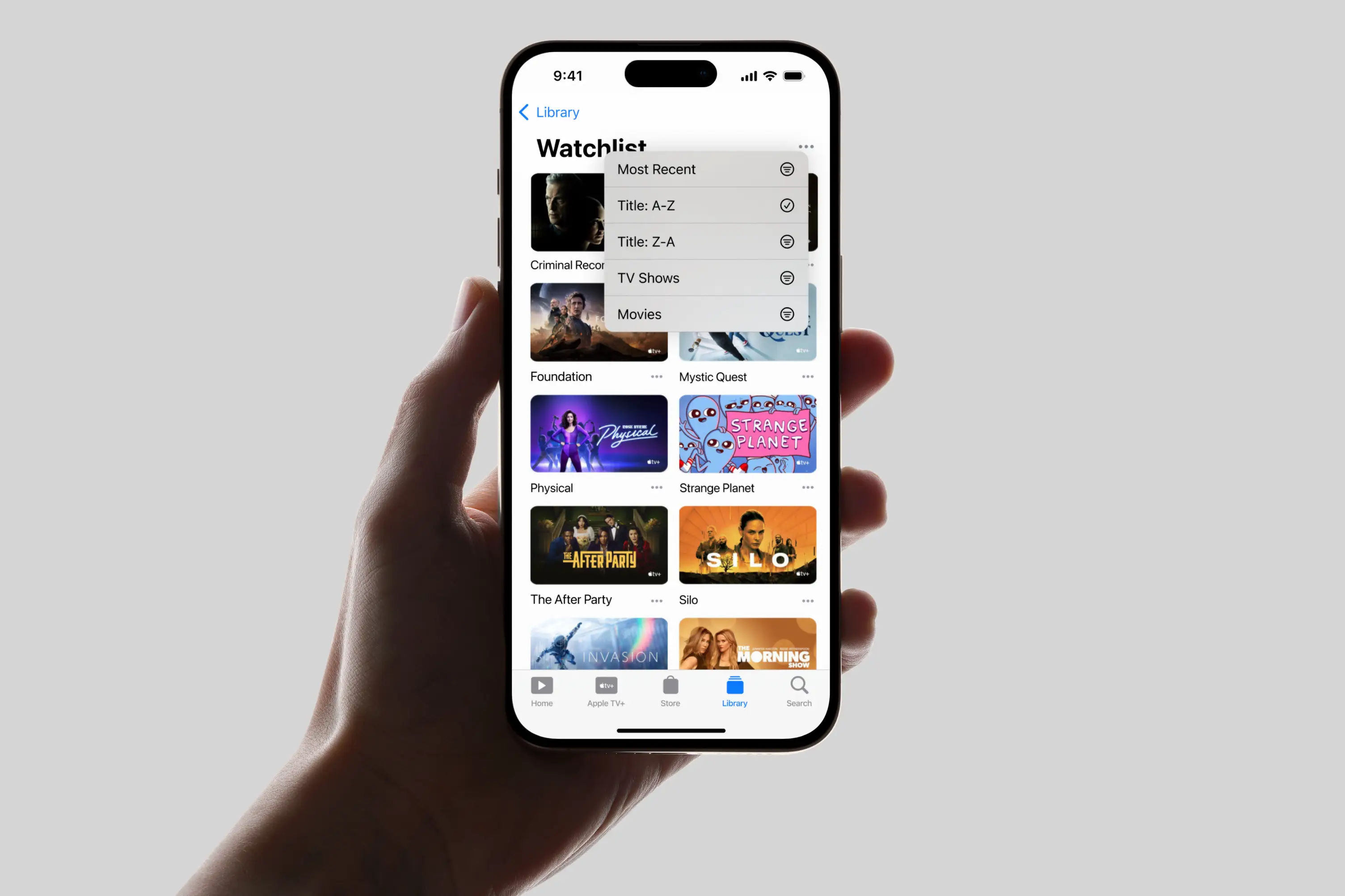
Hand holding iPhone showing Apple TV Watchlist with various TV shows and sorting options menu.
Jumping right in: Easily access your Watchlist via the Library → Watchlist.
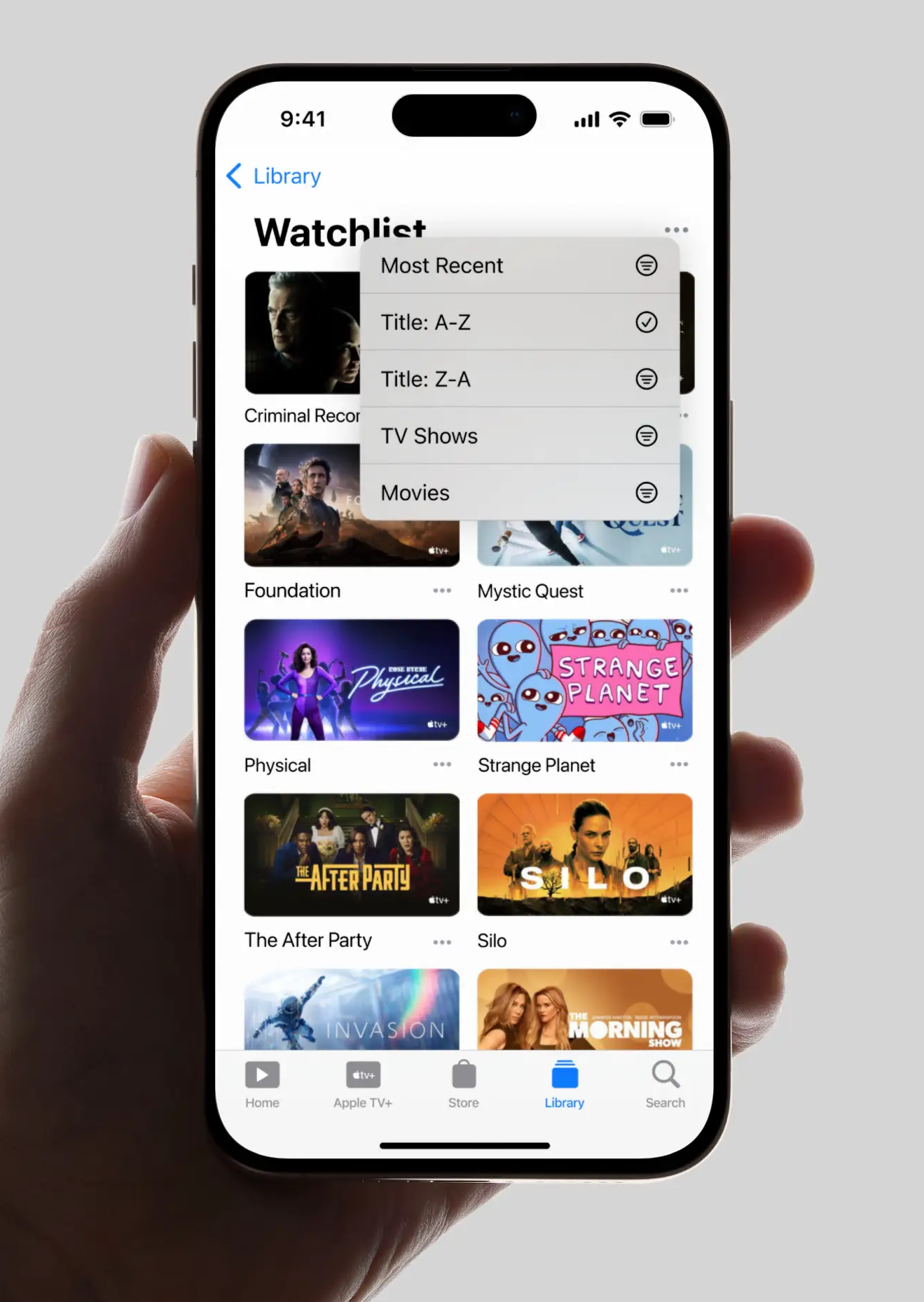
Hand holding phone showing Apple TV+ Watchlist sorted A-Z with thumbnails of various TV shows.
Jumping right in: Easily access your Watchlist via the Library.
02

The Problem: The "Up Next" Confusion

The Selection Problem

I discovered three critical insights from research:

1. The Confusion Was Real

Users consistently described feeling lost when trying to manage their viewing intentions. One user captured it perfectly:

"I can literally go to a show, see that I've added it to my list, yet the list is NO WHERE to be found."
Another stated: "The 'up next' is NOT a 'my list' or 'favorites' like EVERY other streaming app❗️"

2. Clear Mental Models from Other Platforms

74% of streaming users actively use watchlists elsewhere, meaning they came to Apple TV with established expectations. Fighting these patterns would be like swimming upstream.

Users expected to:
• Save content for later viewing
• Organize future viewing plans separately from in-progress shows
• Receive notifications when saved content premieres/nears premiering

3. Intent, Not Just Organization

Users wanted to save content for two distinct reasons:
• 63% to plan their viewing schedule
• 50% as a memory aid for later viewing

The current "Up Next" queue mixed:
• Shows they're actively watching
• Shows they want to watch later
• Shows they started but abandoned

This cognitive overload created the core problem: mixing planned content with in-progress shows.

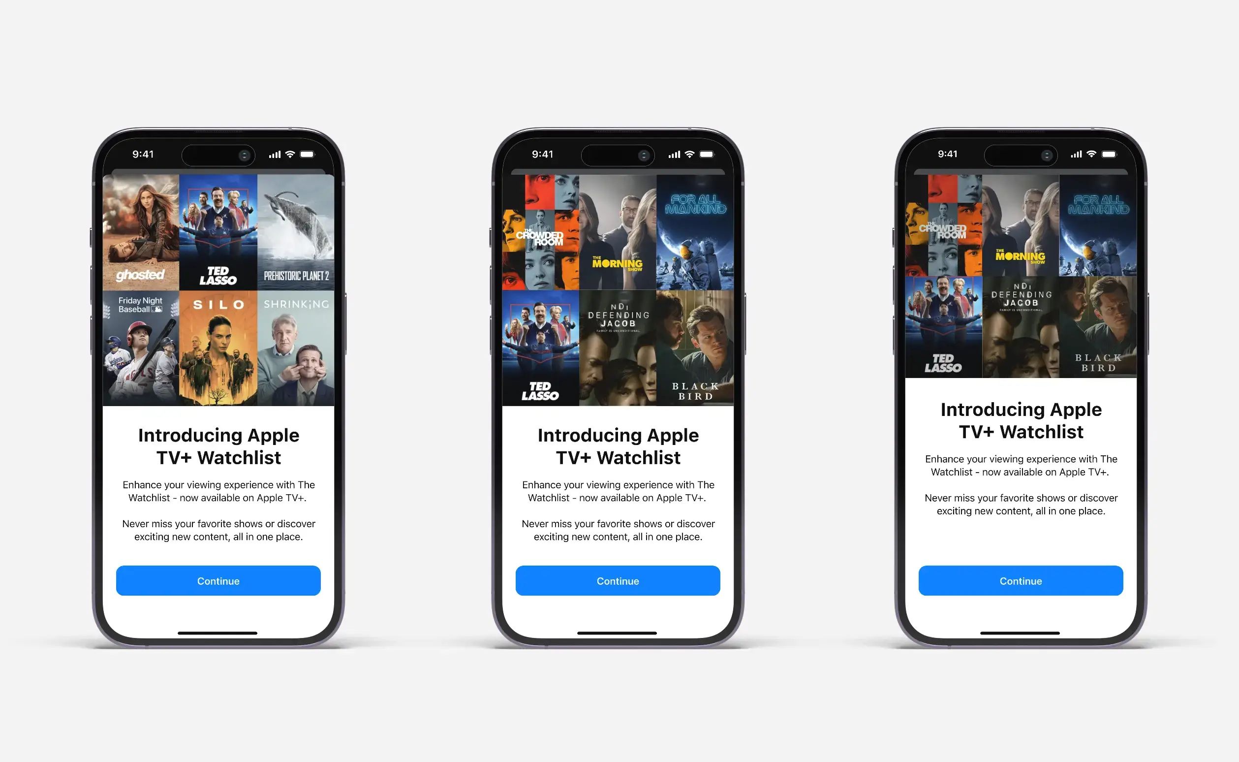
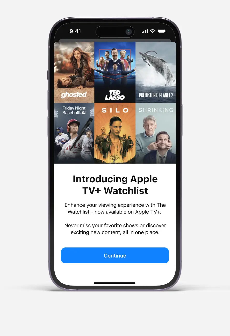
Three iPhones show Apple TV+ Watchlist screens with various show posters and a Continue button.
Introducing Apple TV Watchlist: Chosen design (first) and alternate versions of the Watchlist announcement.
iPhone screen showing Apple TV+ Watchlist feature with six show thumbnails and a Continue button.
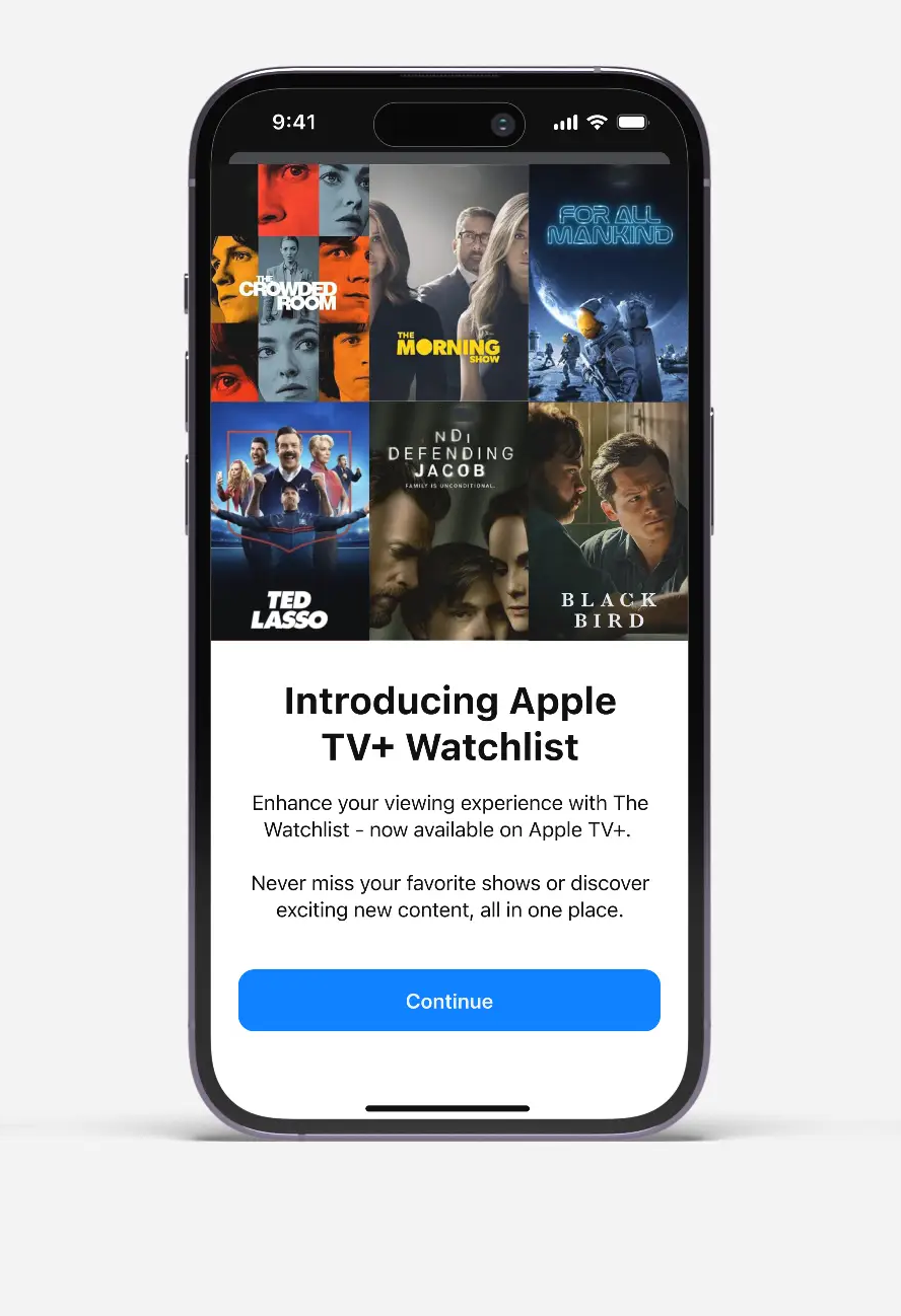
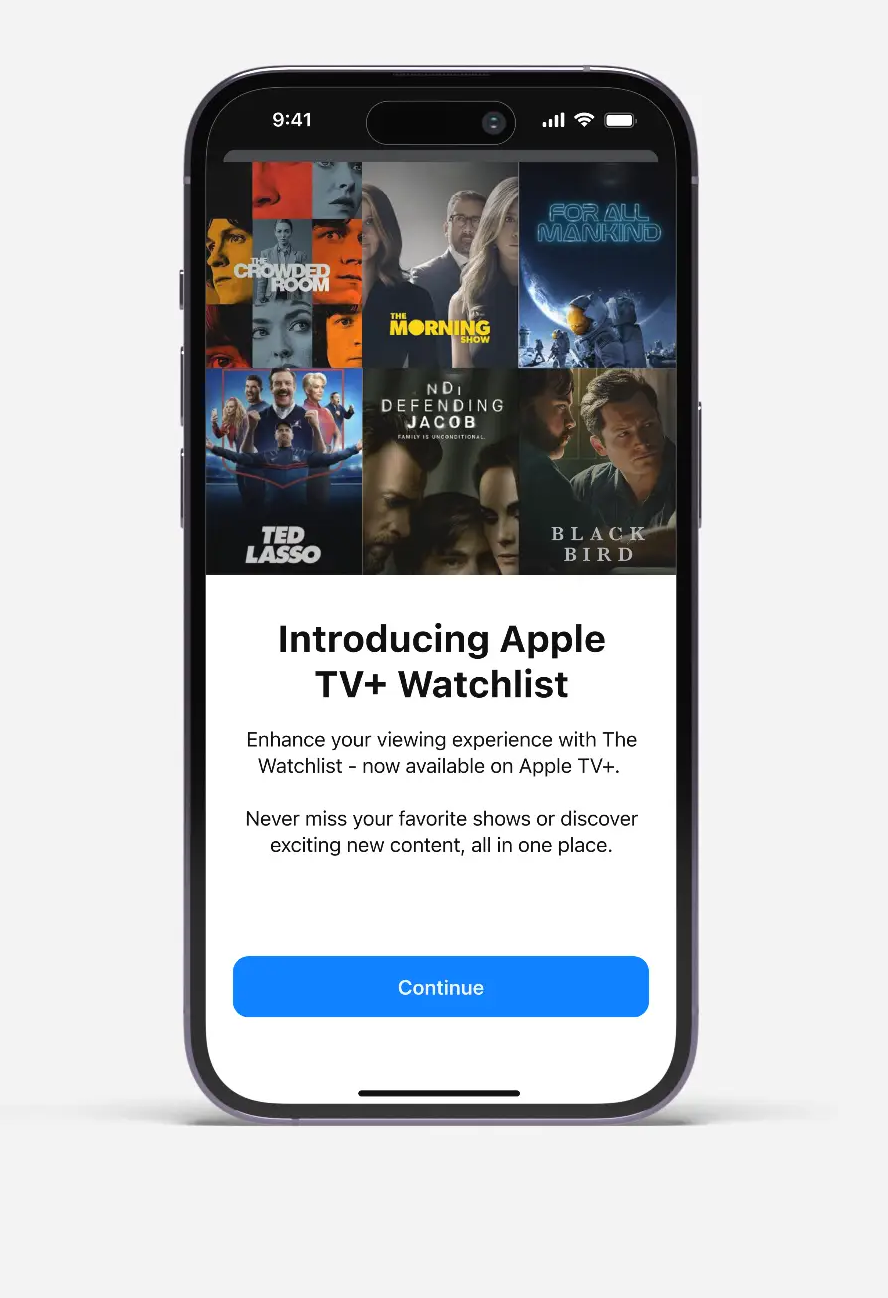
Chosen design (first) and alternate versions of the Watchlist announcement interstitial (disregarded).
iPhone screen showing Apple TV+ Watchlist intro with show thumbnails and a blue Continue button.
iPhone screen showing Apple TV+ Watchlist intro with show posters and a blue Continue button.
03

Design Approach: Strategic Design Decisions

After identifying the core problem, I faced three interconnected challenges:

Challenge 1: Integration

• How might we integrate a watchlist feature into Apple’s streaming app to address user demand and improve content discovery?

Intuitive Interaction: Defining user interactions for adding, removing, and sorting saved content, utilizing design components.

Challenge 2: Visual Cohesion

• How might we design a watchlist interface that seamlessly integrates with the overall Apple TV+ aesthetic?

Visual Design Cohesion: Designing the watchlist feature to visually align with the overall Apple TV+ aesthetic and functionality.

Challenge 3: Information Architecture

• How might we design an intuitive watchlist functionality that caters to users' needs and preferences for effective content organization?

Information Architecture: Determining the optimal level of detail displayed within the watchlist, like episode progress or year of release.

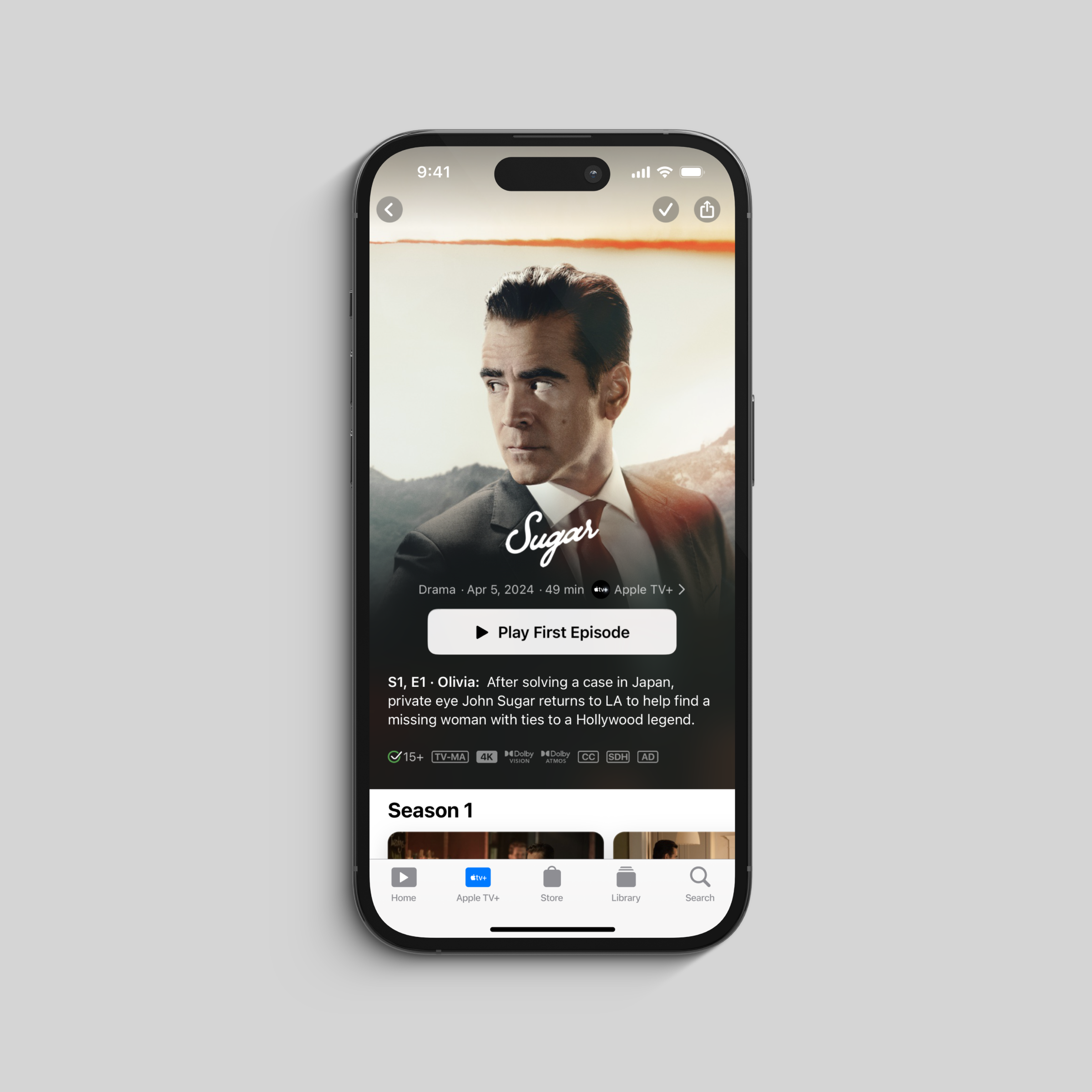
iPhone screen showing Apple TV+ series Sugar with a man in a suit and option to play trailer.
Apple TV+ screen showing drama Sugar with John Sugar in suit, play first episode button, and episode description.
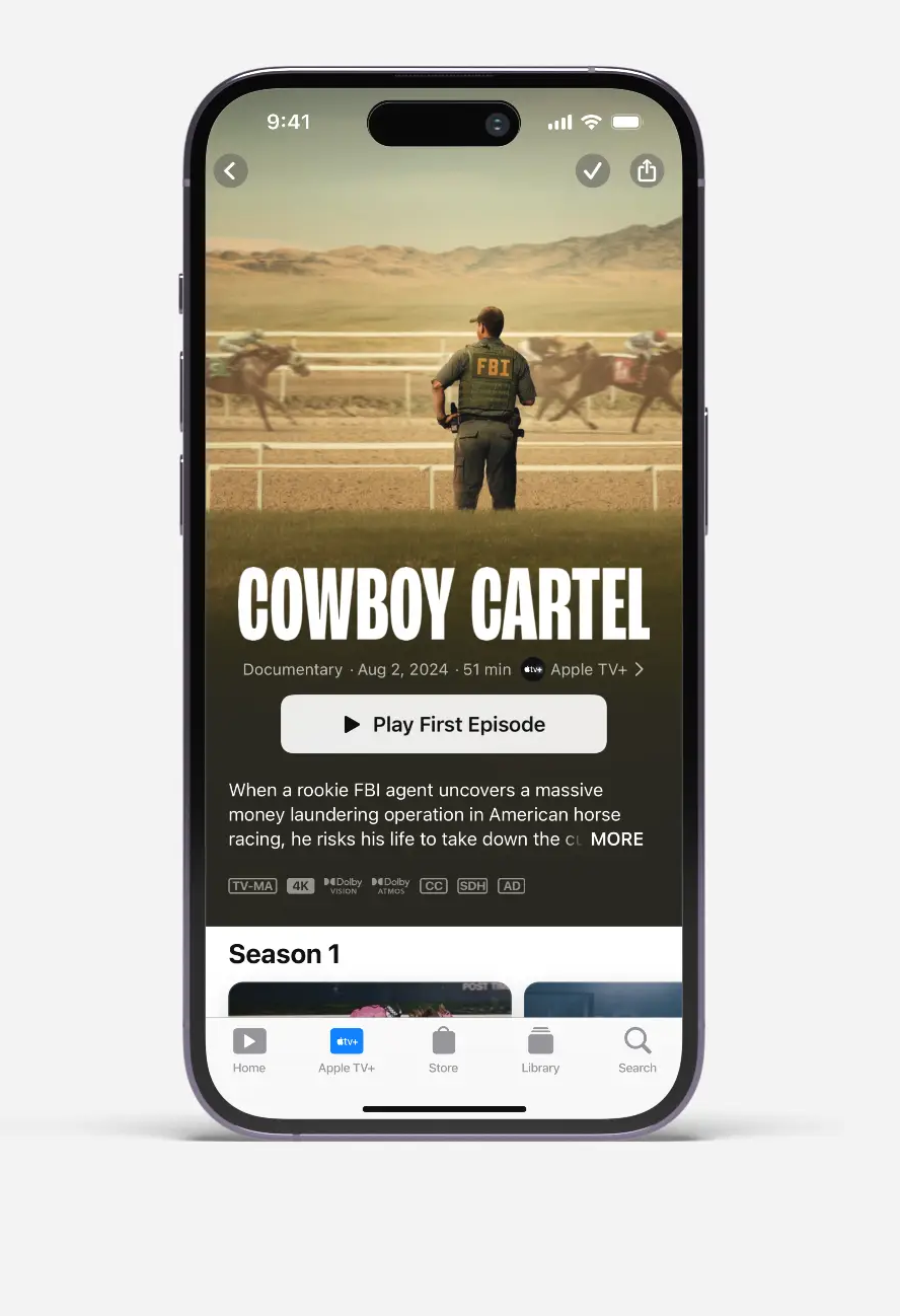
Homepage integration showing how watchlist items are visually distinguished with a checkmark indicator in the top-right corner.
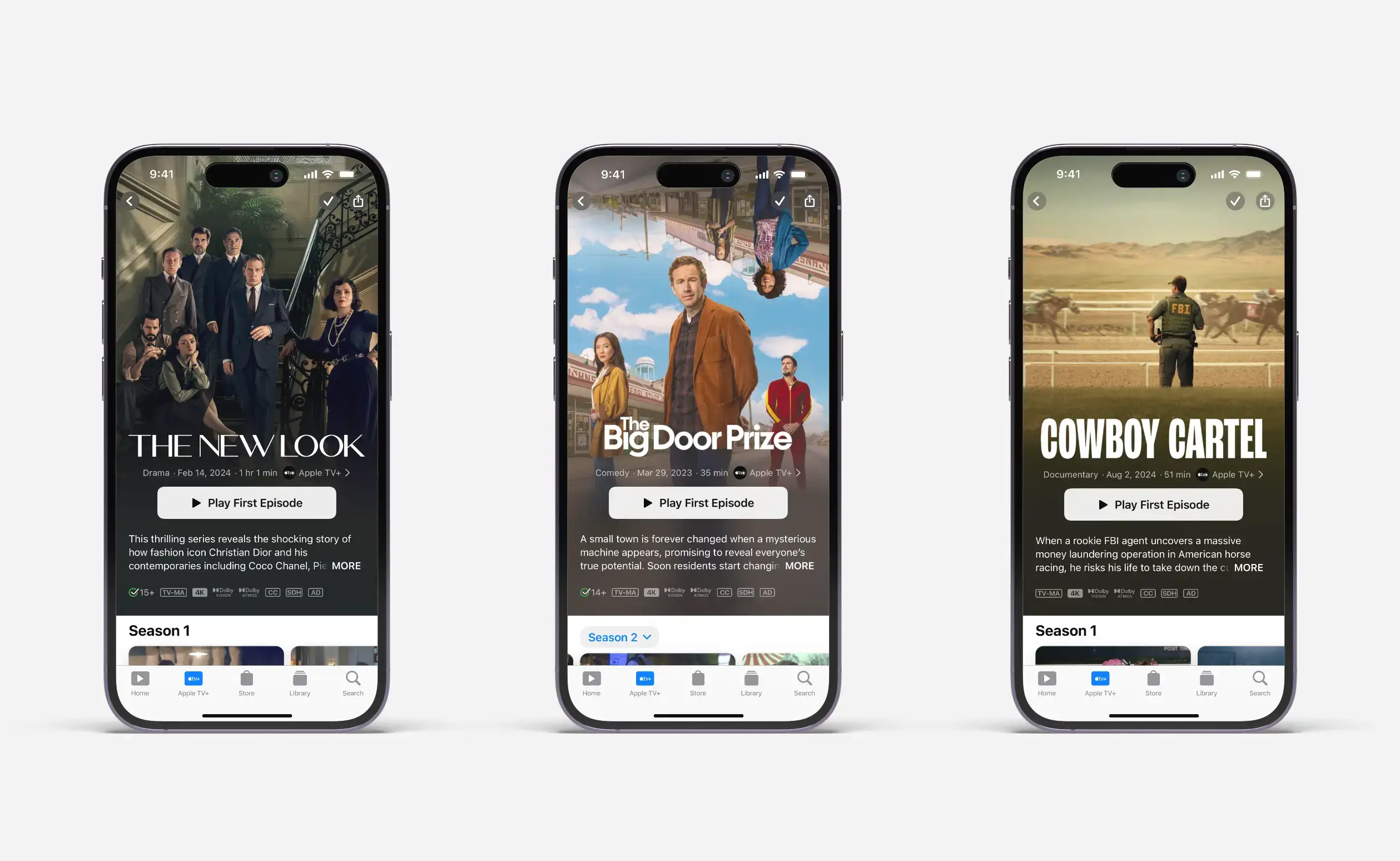
Three iPhones display Apple TV+ shows: The New Look, The Big Door Prize, and Cowboy Cartel.
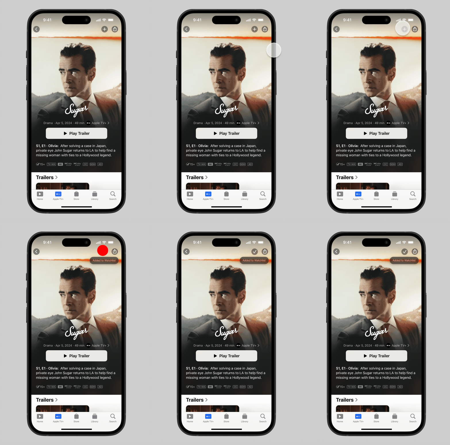
Watchlist Integration: Users can easily remove Watchlist content by tapping the checkmark indicator again, serving a dual purpose.
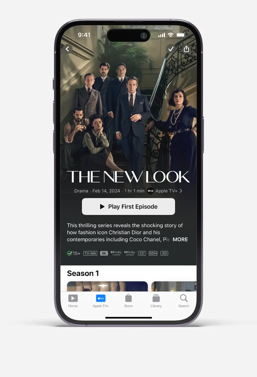
Mobile screen showing Apple TV+ series The New Look with cast photo and play first episode button.
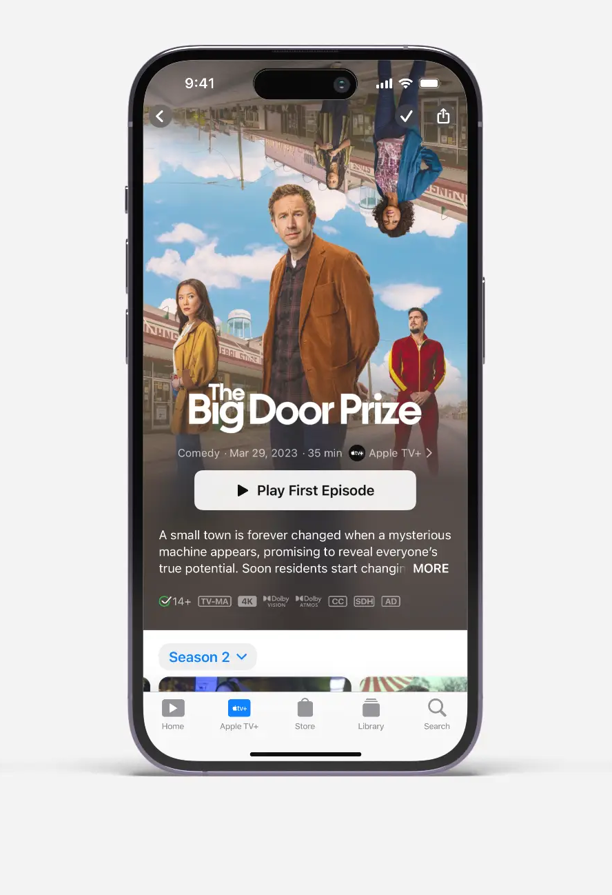
Show detail pages with Watchlist integration - checkmarks in the top-right corner indicate it's saved content making saving and removing shows easy.
Apple TV+ screen on iPhone showing The Big Door Prize series with cast and play first episode button.
iPhone screen showing Cowboy Cartel documentary on Apple TV+ with FBI agent at horse race and play episode button.
04

Key Design Decisions

Separate from "Up Next"

User research revealed that most users add watchlist content to plan viewing, while 50% use it as a memory aid. Mixing planned content with in-progress shows creates cognitive overload.

Clear separation was non-negotiable.

Strategic Placement

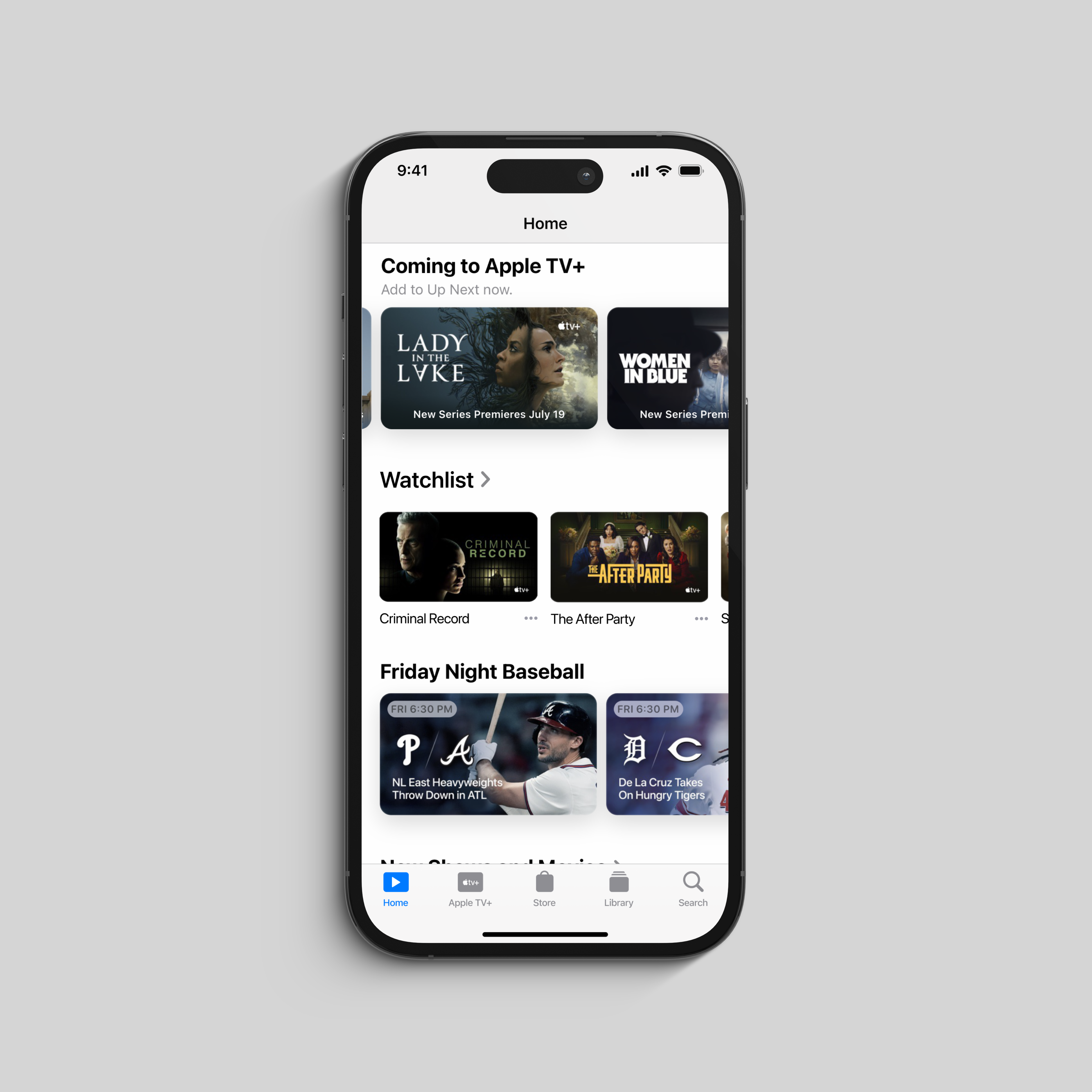
Positioned below "Browse by Genres" on the homepage for optimal visibility without disrupting the established hierarchy. A/B testing confirmed this placement felt natural—clearly distinguishable from "Up Next" while still being quickly discoverable on Apple TV Home.

Smart Notifications

Rather than overwhelming users, I designed contextual notifications pushed when watchlisted content premieres—transforming passive saves into active viewing triggers.

Native iOS Patterns

One-tap save/remove Watchlist content matching iOS conventions users already know. Checkmark indicator in top-right corner provides instant visual confirmation of the status.

iPhone displaying Apple TV app home screen with shows, watchlist, and Friday Night Baseball schedule.
The mid-level placement allowed for rapid content discovery, just below Browse by Genre, a hierarchical order that felt natural to my test group.
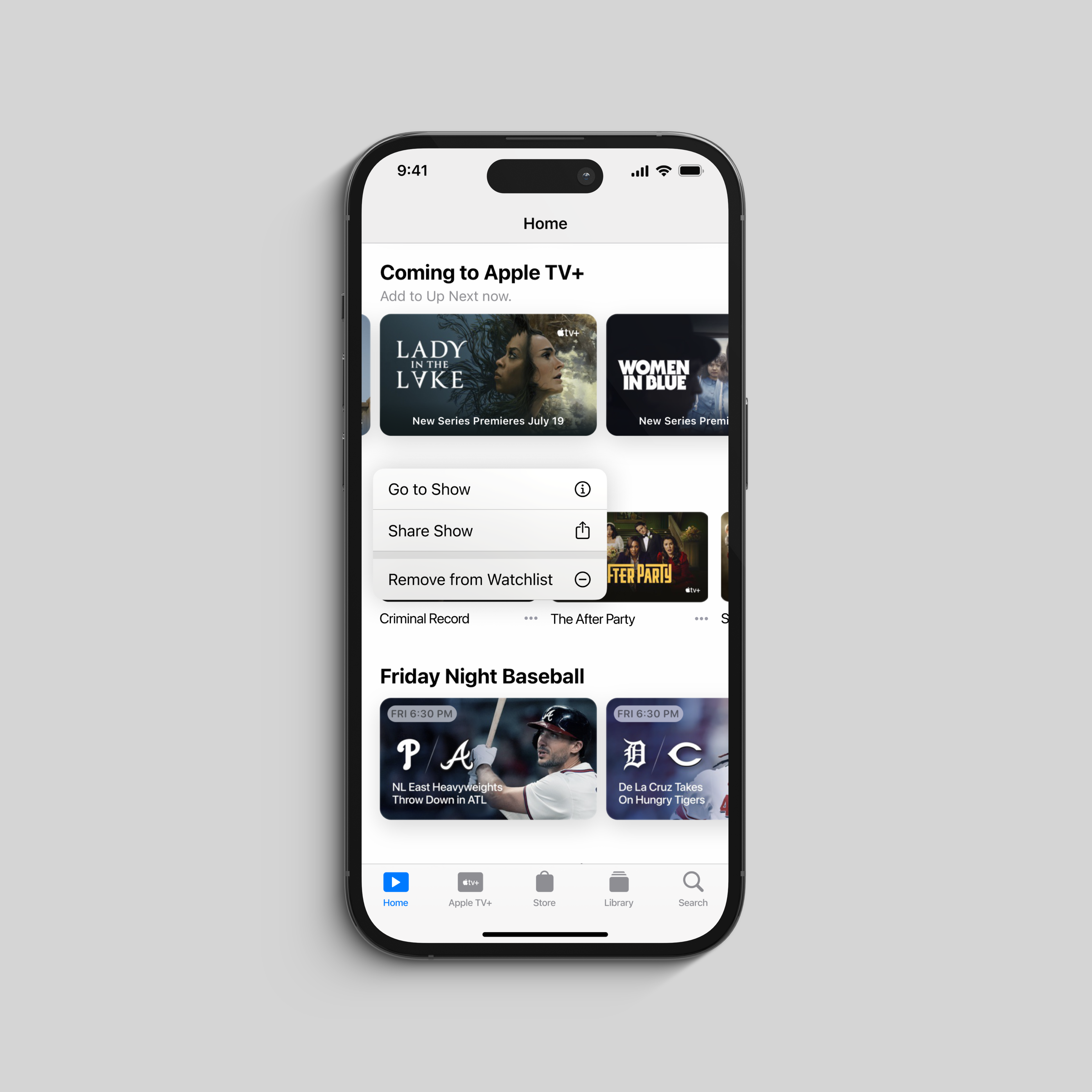
iPhone screen showing Apple TV+ app with Coming shows, Friday Night Baseball, and watchlist menu options.
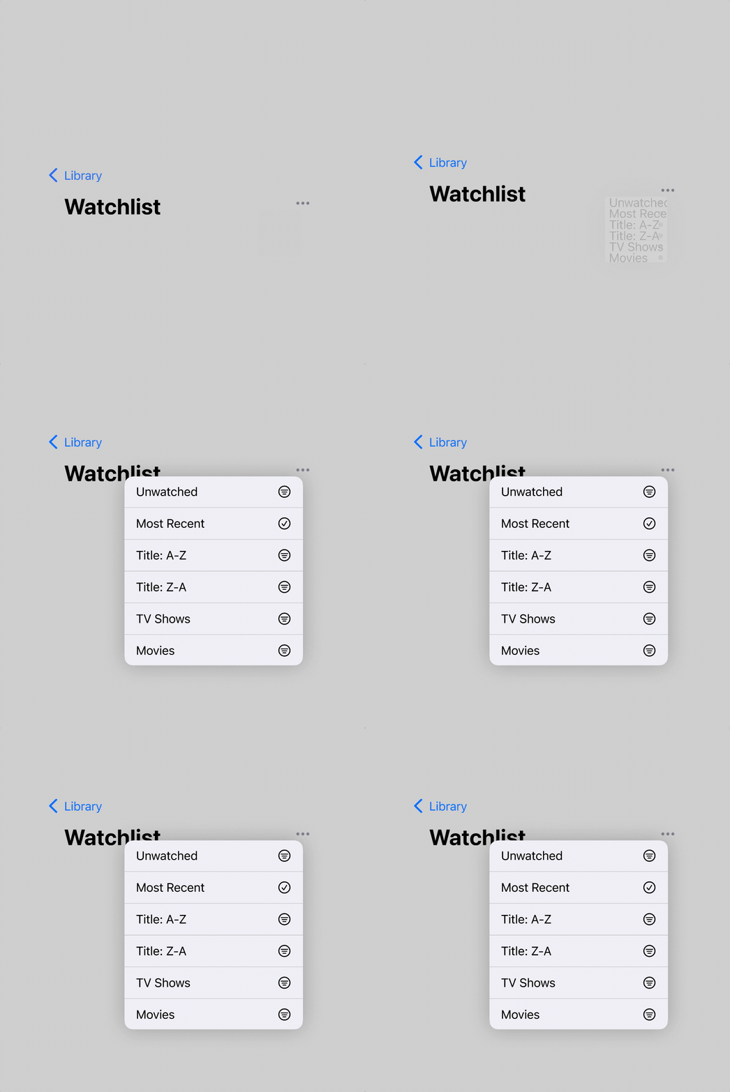
Action Menu: Long-pressing or tapping the menu icon (⋯) on any watchlist item reveals contextual actions already native to the app.
05

Core Features Delivered

1. One-Click Content Saving

Instant add/remove from any content page with visual confirmation. The watchlist feature integrates seamlessly across Apple TV, replacing functionality that previously cluttered the "Up Next" queue.

Visual Confirmation: Homepage integration shows watchlist items with checkmark indicator in top-right corner. Show detail pages display the same checkmark, making saving and removing shows effortless.

2. Smart Content Management

Automatic Premiere Notifications:
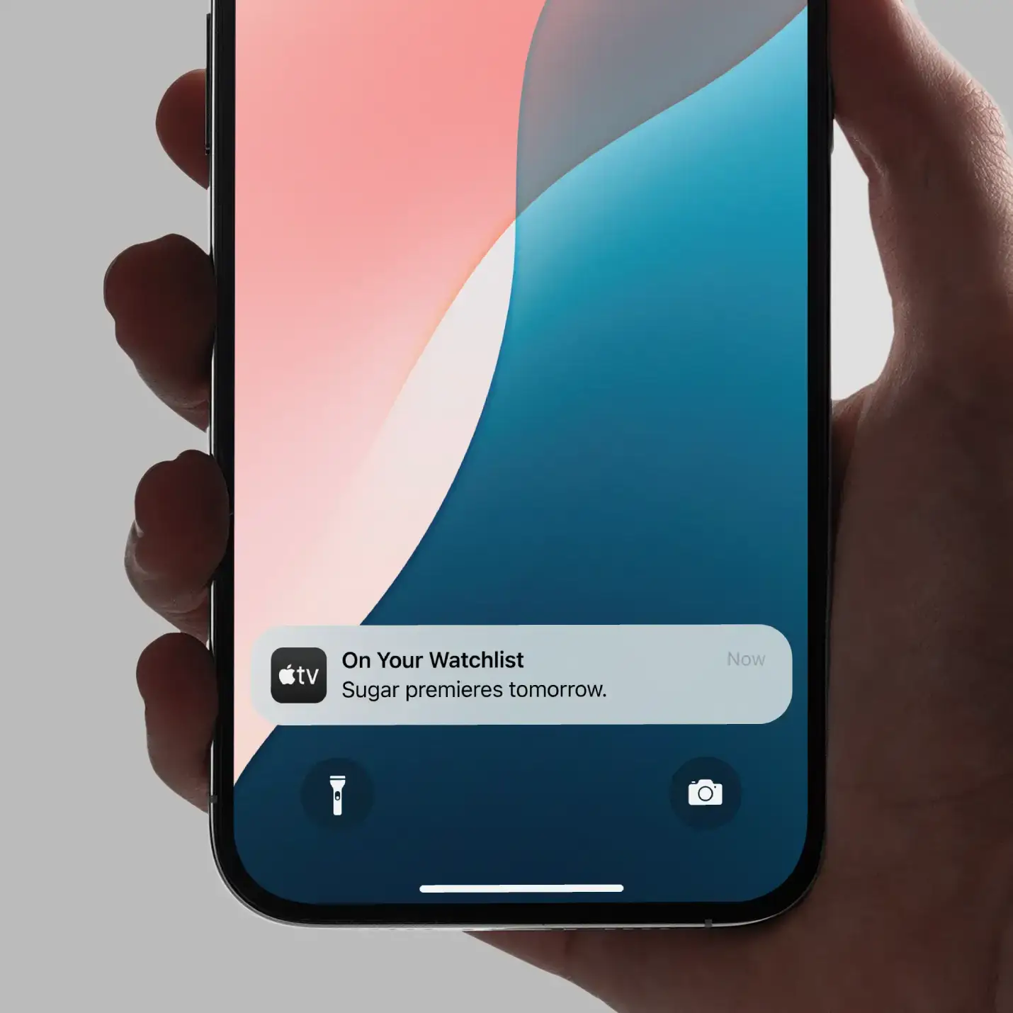
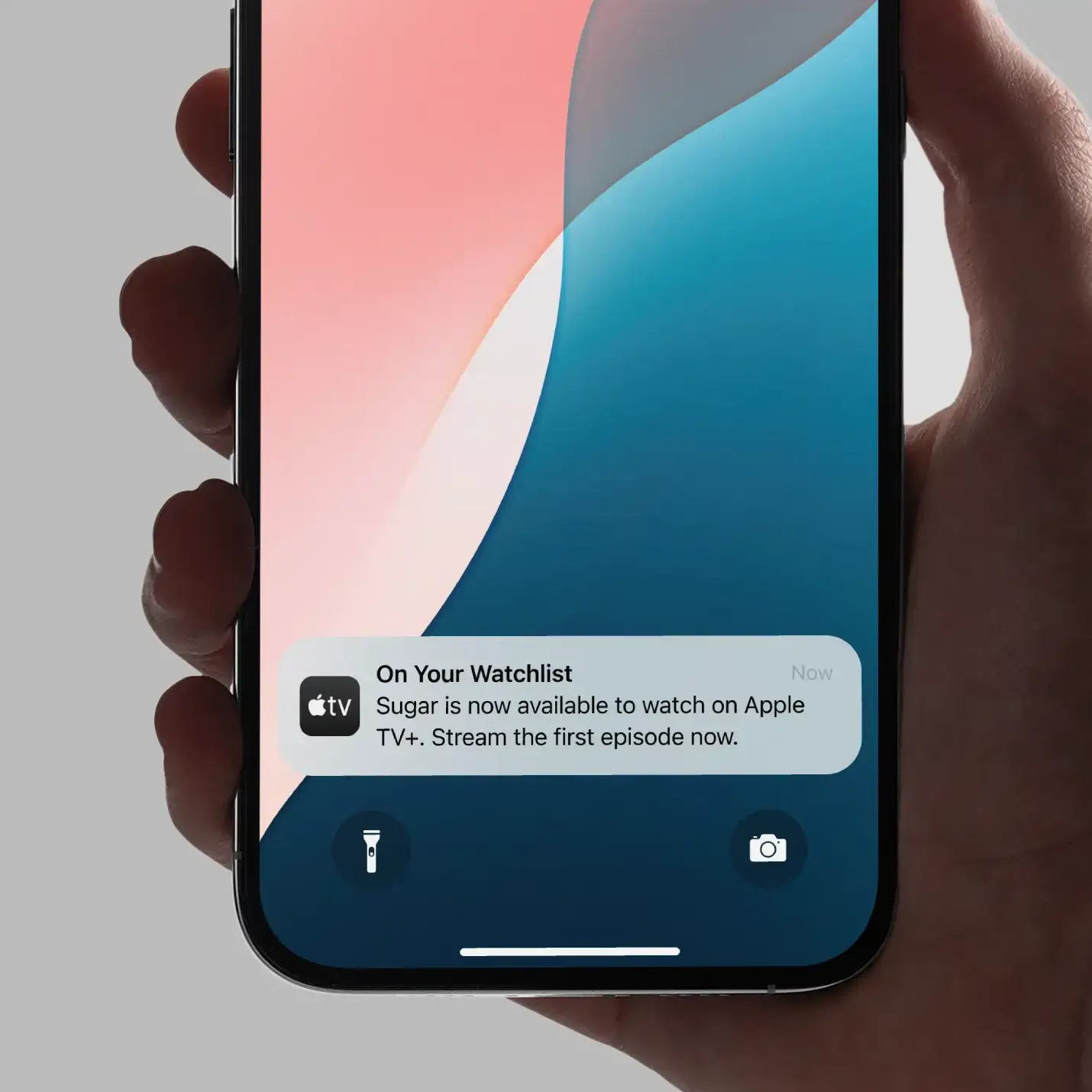
When watchlisted content releases, push notifications remind subscribers and navigate directly to the show. Notifications are strategically timed to maximize engagement:

"On Your Watchlist: Sugar premieres tomorrow."
• "On Your Watchlist: Sugar is now available to watch on Apple TV+. Stream the first episode now."

Intelligent Transfer:
If a user adds an upcoming release to their watchlist, once the content premieres, it automatically appears in the "Up Next" queue—bridging future intent with immediate viewing.

3. Strategic Placement & Discovery

Mid-Level Homepage Placement:
The Watchlist section displays as a horizontal scroll of saved content with show titles visible below thumbnails, positioned just below "Browse by Genres" on Apple TV's homepage.

Library Access:
Easily accessible through Library → Watchlist for users who want comprehensive management. This dual-access pattern serves both casual browsers and organized curators.

Action Menu:
Long-pressing or tapping the menu icon (…) on any watchlist item reveals contextual actions—remove from watchlist, add to Up Next, or share.

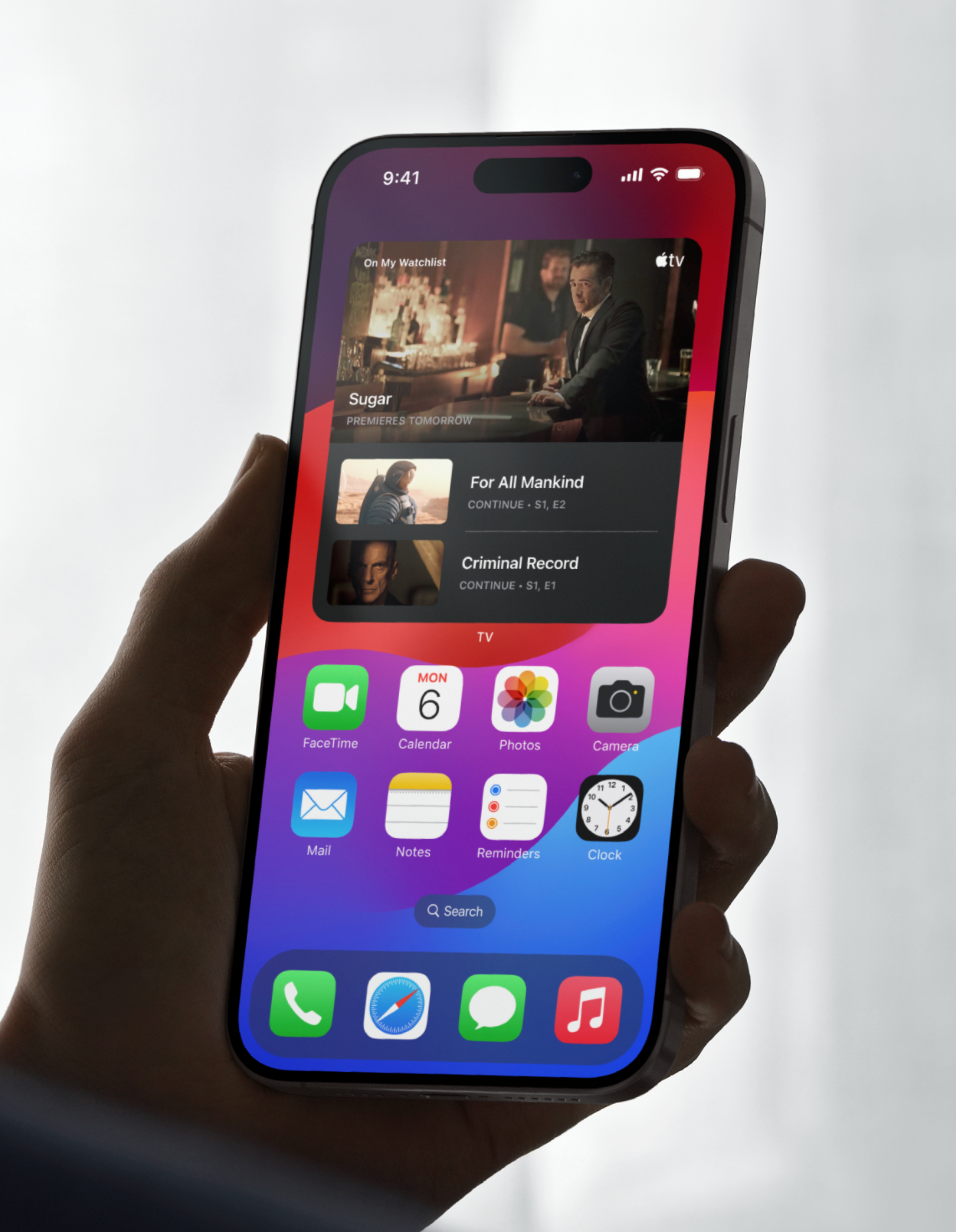
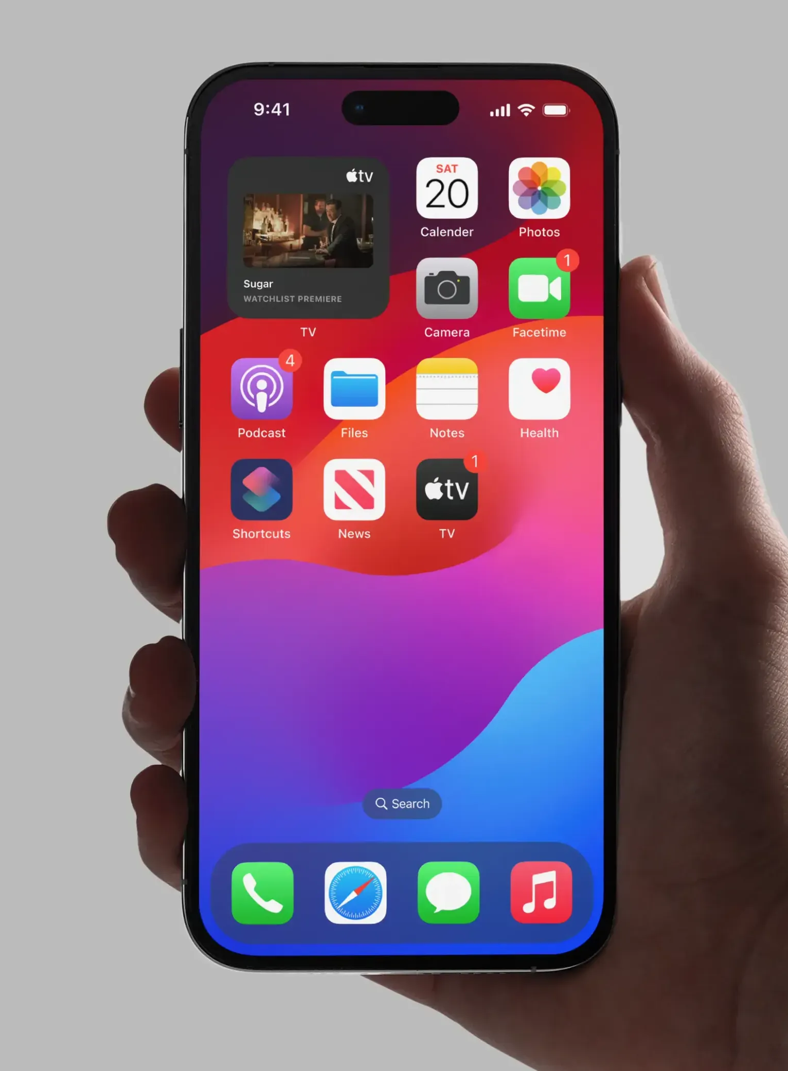
Hand holding smartphone showing Apple TV app widgets with shows Sugar, For All Mankind, and Criminal Record.
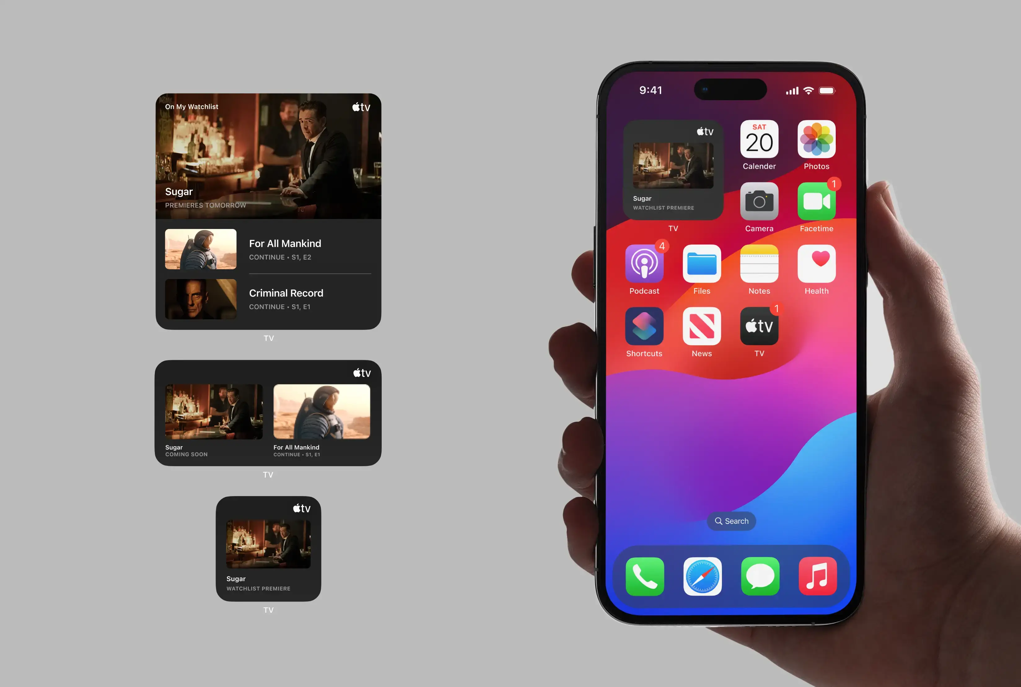
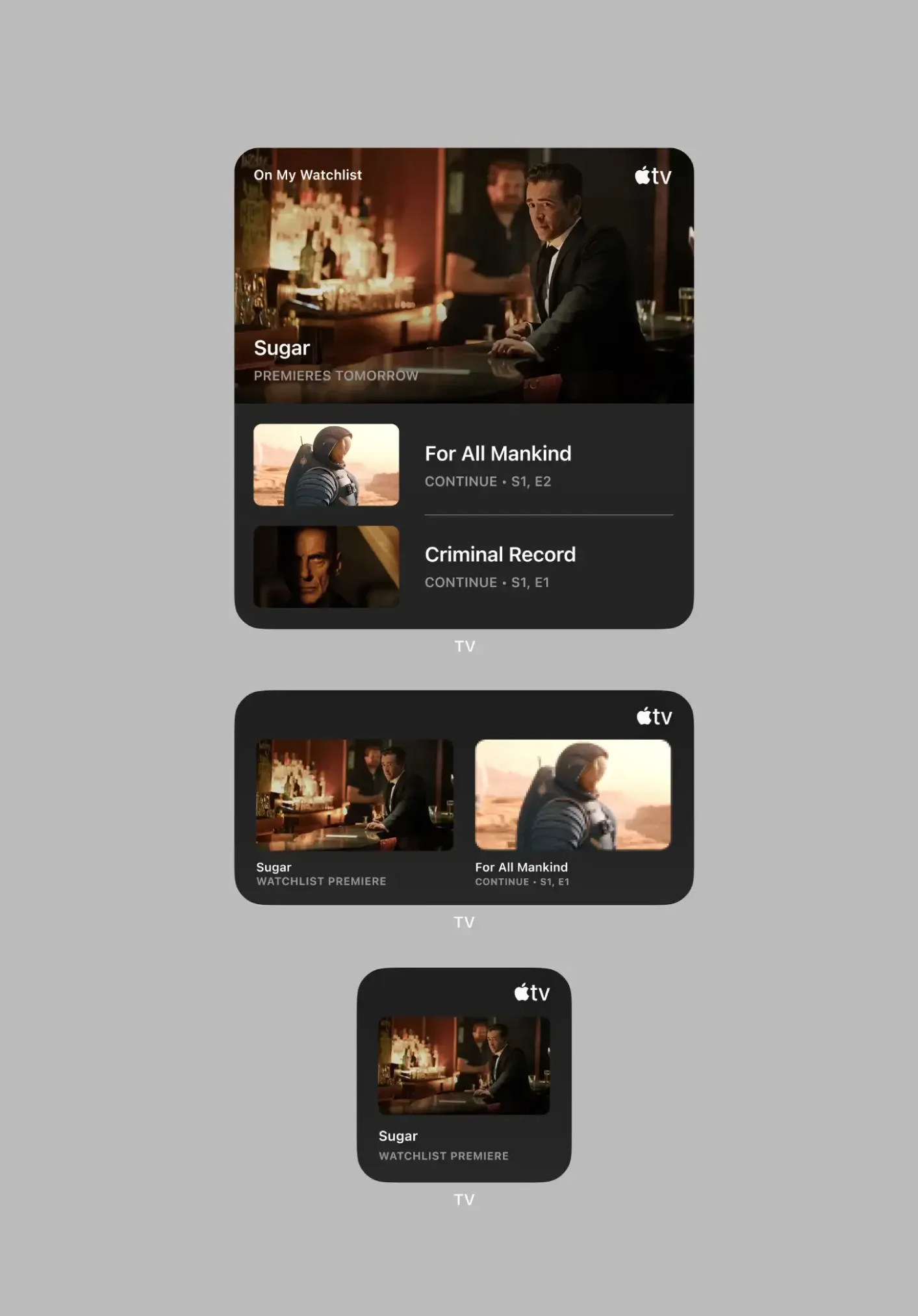
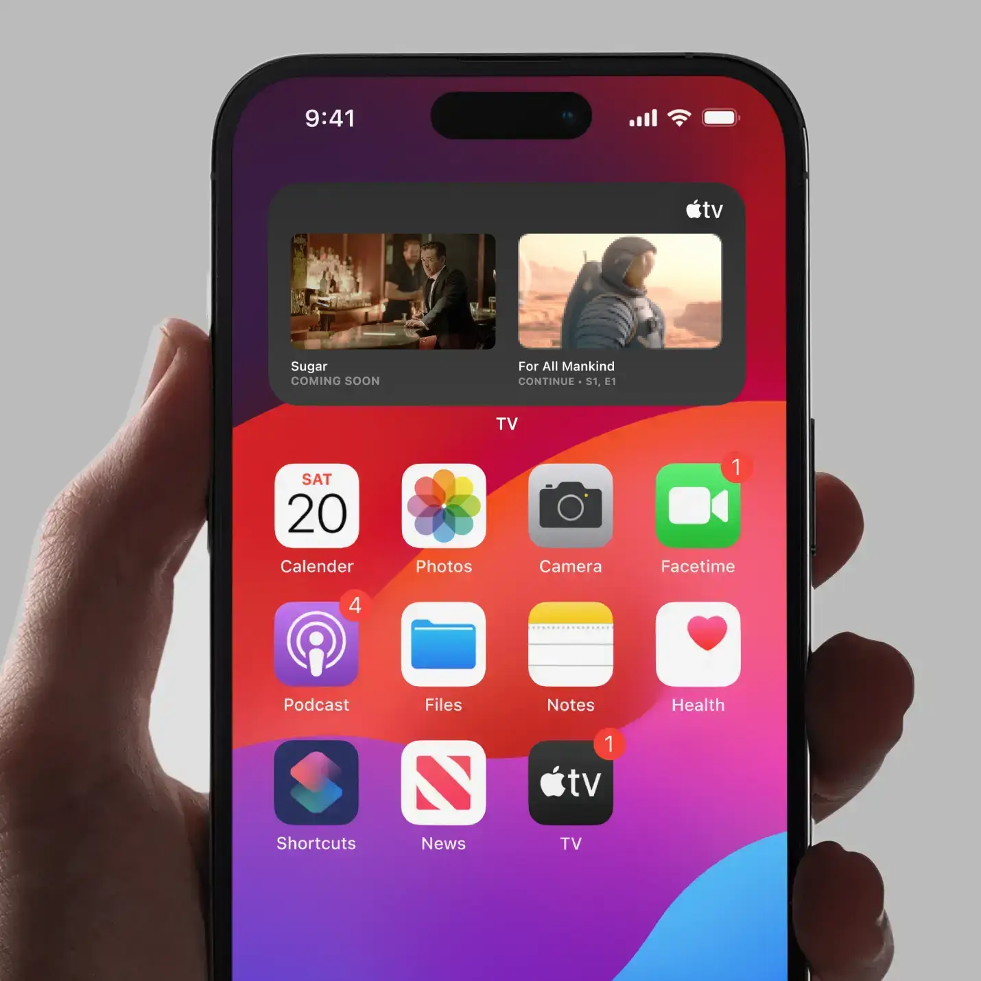
Small Widget | "Watchlist Premiere” (Premiered today).
Medium Widget
| Coming soon (e.g. premieres in 3 days)
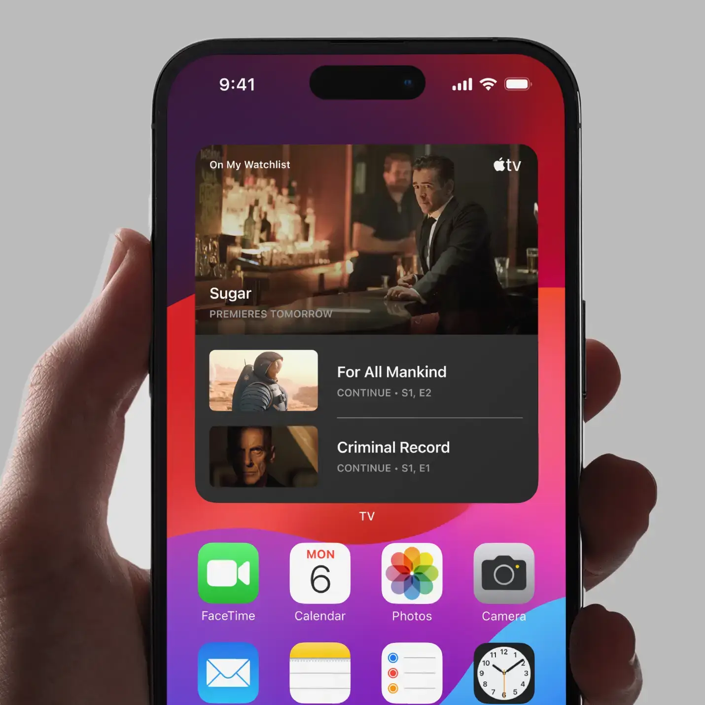
Large Widget
| Premieres tommorrow
Hand holding smartphone displaying colorful home screen with app icons and notification badges.
Apple TV interface showing 'Sugar' premiere and shows 'For All Mankind' and 'Criminal Record' to continue.
Small Widget | "Watchlist Premiere” (Premiered today).
Medium Widget
| Coming soon (e.g. premieres in 3 days)
Large Widget
| Premieres tommorrow
Hand holding smartphone displaying Apple TV notification: Sugar premieres tomorrow on your watchlist.
On Your Watchlist
Sugar Premieres tomorrow.
Hand holding iPhone showing Apple TV notification for new show Sugar available to stream.
On Your Watchlist
Sugar is now available to watch on Apple TV+. Stream the first episode now.
06

Impact & Reflection

Design Decisions That Drive Value

Why Separate from "Up Next"?

The data was clear: 63% of users plan viewing vs. 50% using watchlists as memory aids. The "Up Next" queue served a different mental model—tracking current progress, not future intent. Separation eliminated cognitive overload.

The Notification Strategy

Rather than alerting users every time they add content (annoying), notifications trigger only when watchlisted content is premiering. This transforms passive saves into active viewing moments—the exact business outcome Apple needs.

Visual Hierarchy for Content Promotion

The watchlist placement strategically promotes Apple's original content while giving users control over their viewing pipeline. When Apple wants to push a new show, users can save it—likely increasing viewership stats and indicating strong interest ahead of premiere.

Hand holding an iPhone showing apps like Calendar, Photos, Podcasts, and Apple TV with watchlist widget.
Medium Widget | Copy: Coming soon (e.g. premieres in 3 days)
Smartphone screen showing Apple TV widget with shows Sugar, For All Mankind, and Criminal Record.
Large Widget | Copy: Premieres tomorrow
07

How a Watchlist Boosts Business

Reduces Churn by Increasing "Stickiness"

A personalized watchlist creates stronger emotional investment in the platform. The more content saved, the more invested one may feel in the service, making them less likely to cancel their subscription.

Provides Valuable User Intent Data

A watchlist can offer a dataset of user intent beyond just viewing history. This data can inform future show development and more precise recommendations to users.

Validation: Apple launched this feature in October 2024, confirming the market need and design approach I took—nearly identically with the exception of the dedicated Watchlist page implementation.

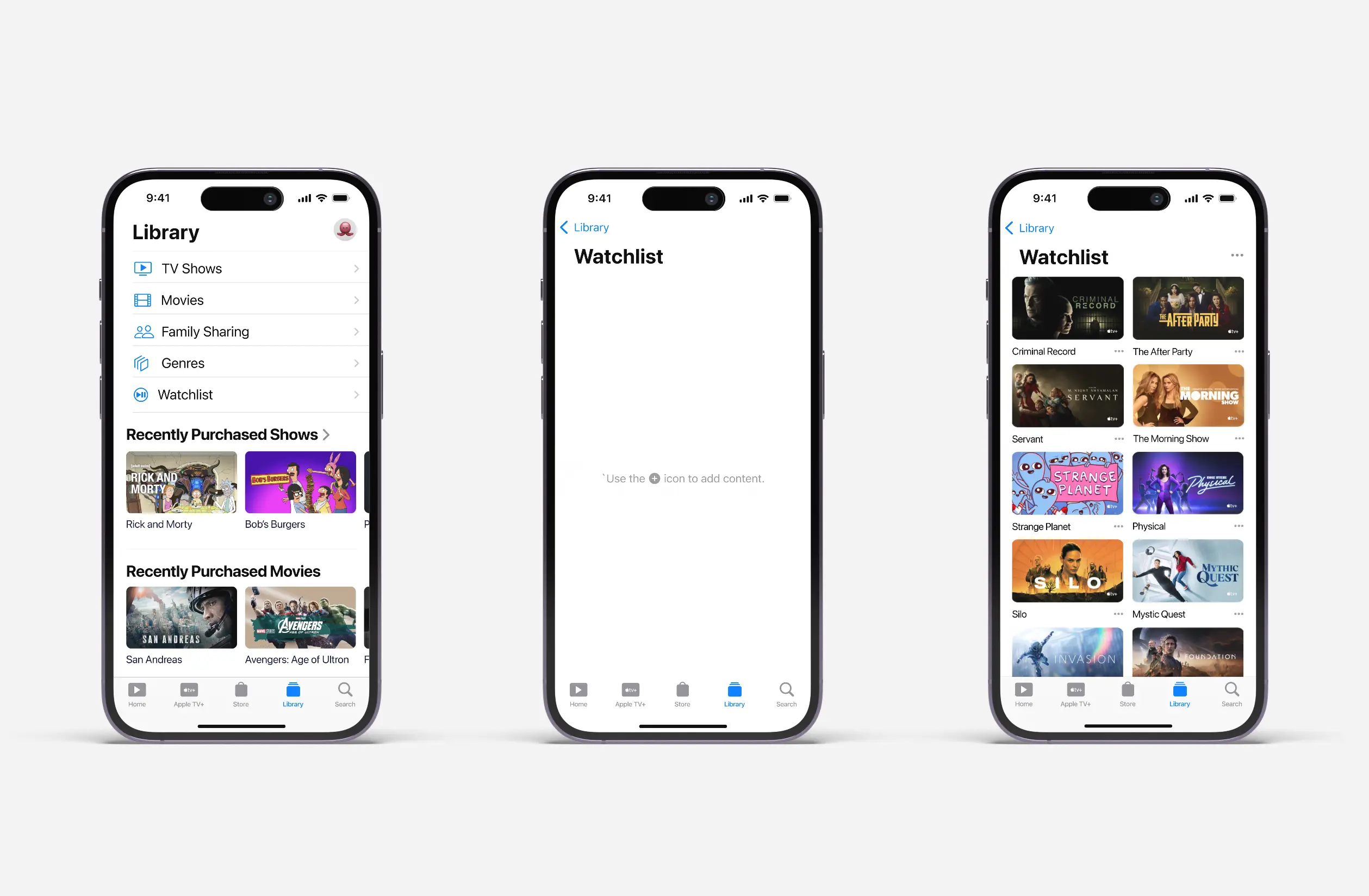
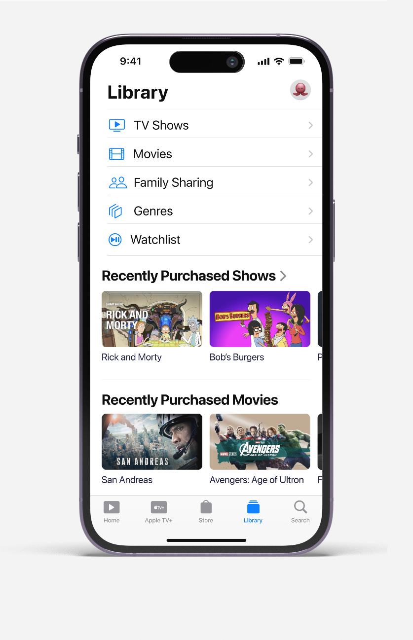
iPhone screen showing Apple TV Library with TV Shows, Movies, Genres, Watchlist, and recently purchased titles.
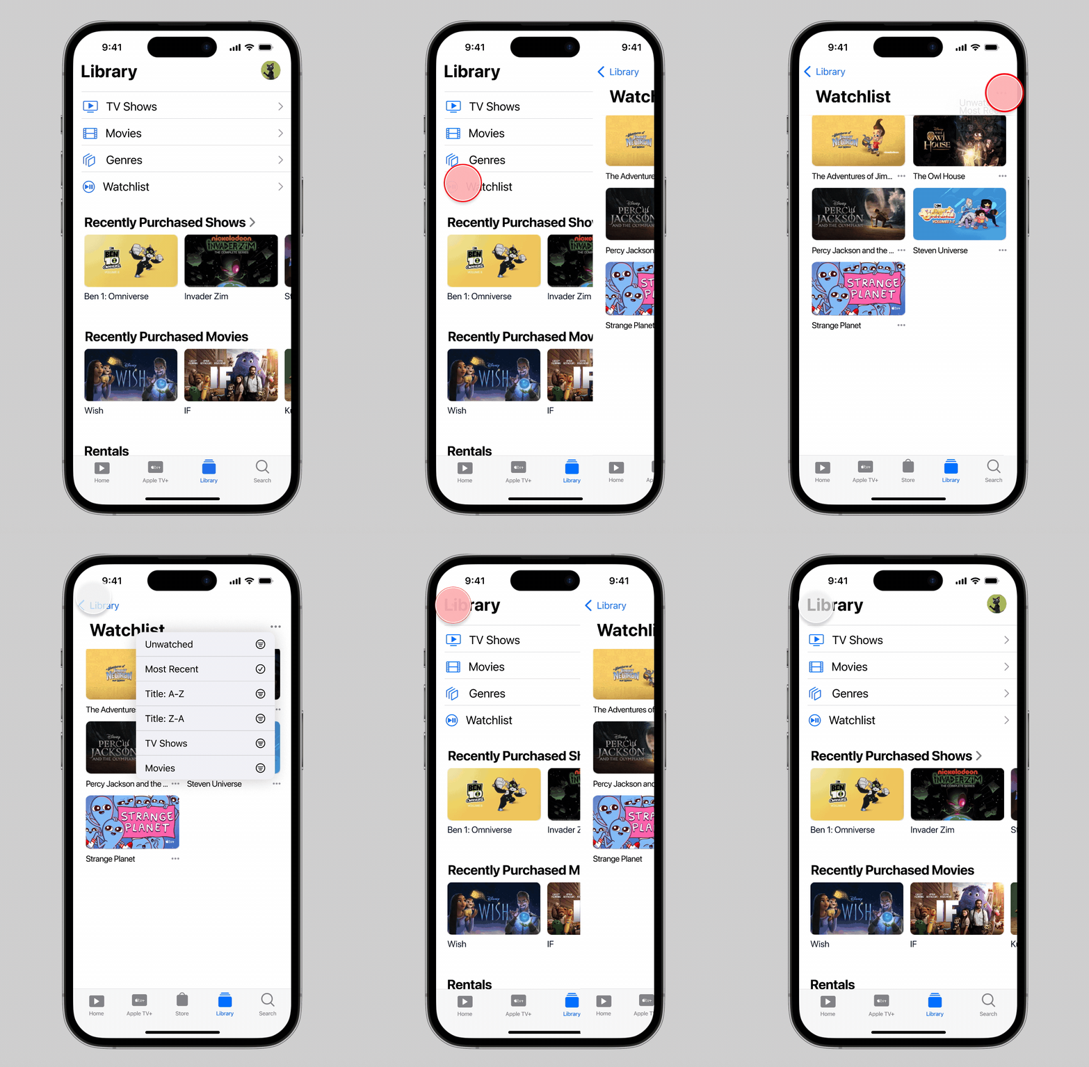
Easily access your Watchlist by going to Library → Watchlist. The Library serves as the central hub for organizing and managing your Apple TV content easily.
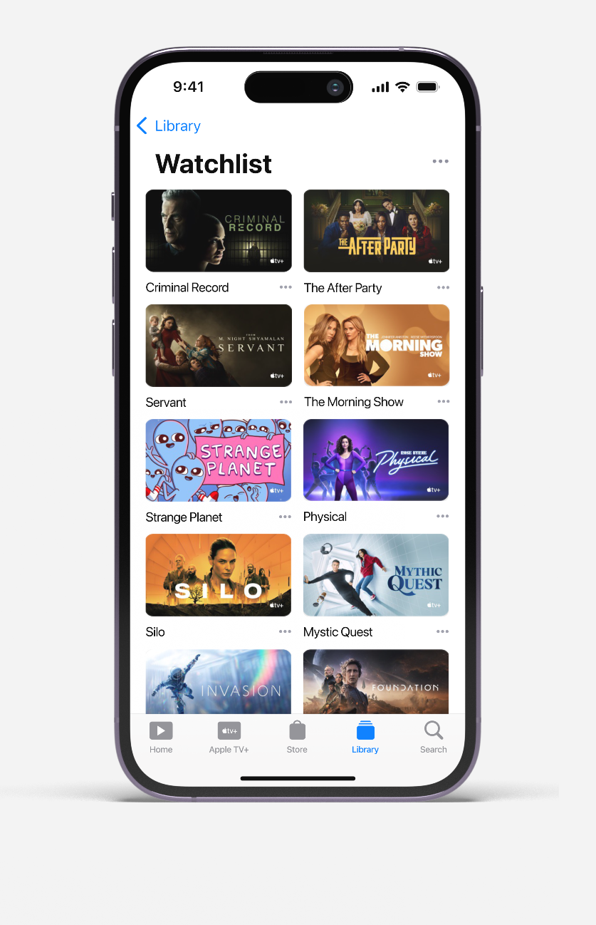
Apple TV Watchlist screen showing added TV shows and movies with options to remove or view.
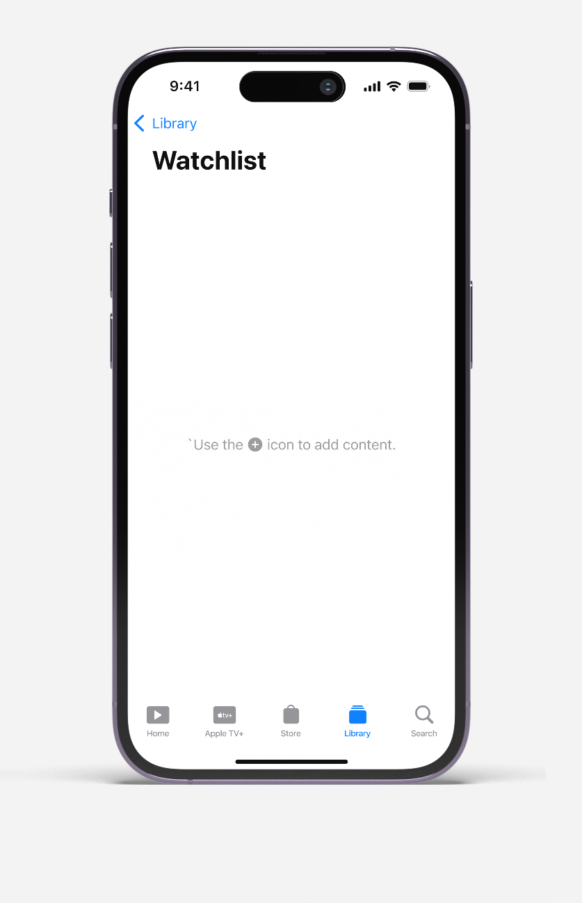
Three iPhones showing Apple TV Library menu, empty Watchlist, and Watchlist filled with TV show thumbnails.
A static view of the Library, followed by the Empty State for the user's Watchlist. Finally, an avid Apple TV viewer's Watchlist content.
Mobile screen showing a library app with TV shows, movies, family sharing, genres, watchlist, and recent purchases.
A static view of the Library, followed by the Empty State for user's Watchlist. Finally, an avid TV subscriber's Watchlist content.
Smartphone screen showing empty Watchlist page with navigation bar and prompt to add content.
Smartphone screen showing a Watchlist in a streaming app with TV show thumbnails and titles.
08

Key Learnings

Industry Standards Exist for a Reason

Sometimes the best design solution is implementing proven patterns that users expect, rather than reinventing familiar interactions. 74% of users already had a mental model for watchlists—fighting it would have been design ego, not user-centered thinking.

User Voice Drives Business Value

The Apple Forum complaints weren't just feature requests—they were retention signals that translated directly to revenue impact. Listening to user feedback revealed what competitors had already filled.

Simplicity Scales

The most successful features often solve the simplest problems. A basic save-for-later function generates more engagement than complex recommendation algorithms. Sometimes less is more.

Future Opportunities

• Social watchlist sharing to drive viral content discovery
• AI-powered watchlist recommendations based on saved content

Other Work

Apple TV Watchlist

2023

Mobile App Design

Apple TV Kids

2022

Mobile App Design

SSENSE

SS26

Art Direction

I built this site!

I built this site!